Rethinking Web Accessibility
Lessons from a Sight Impairment Charity's Success Lessons for charities

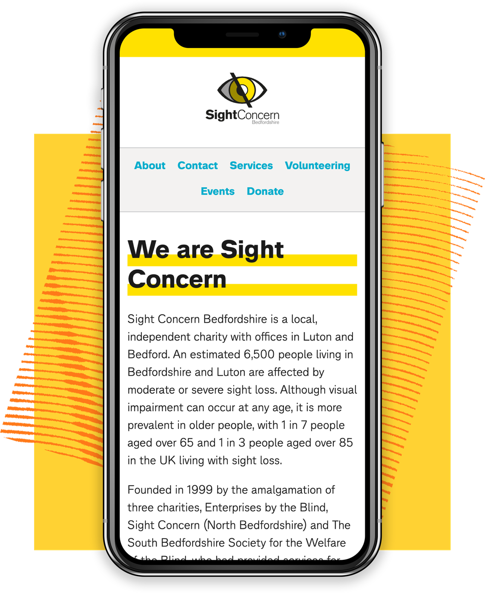
Web accessibility is a crucial aspect of modern website design, yet it's often overlooked or considered too challenging to fully implement. However, a recent collaboration between Sight Concern Bedfordshire, a local sight impairment charity, and The Developer Society, a not-for-profit digital cooperative, is challenging this perception. Sight Concern Bedfordshire’s new website isn't just raising the bar for accessibility – it's providing valuable lessons for organisations looking to make their online presence more inclusive without breaking the bank.
1. Setting a high bar for accessibility
One of the most significant outcomes of this project is demonstrating that high-level accessibility is attainable from the outset, while also recognizing that the journey towards full inclusivity is ongoing. The new Sight Concern Bedfordshire website achieved an impressive 95% score on the Silktide index for UK charities at launch, challenging the notion that accessibility always involves significant trade-offs or compromises.
Silktide, which provides accessibility rankings based on compliance with globally-recognised standards, checked over 200 elements and found only a handful of minor issues. Remarkably, this score surpasses a number of household name visual impairment charities. However, Sight Concern Bedfordshire sees this as a strong foundation rather than a final destination, with plans to address the remaining issues and push for even greater accessibility. The charity's approach demonstrates that striving for excellence in accessibility is an ongoing process.
2. Simplicity is key
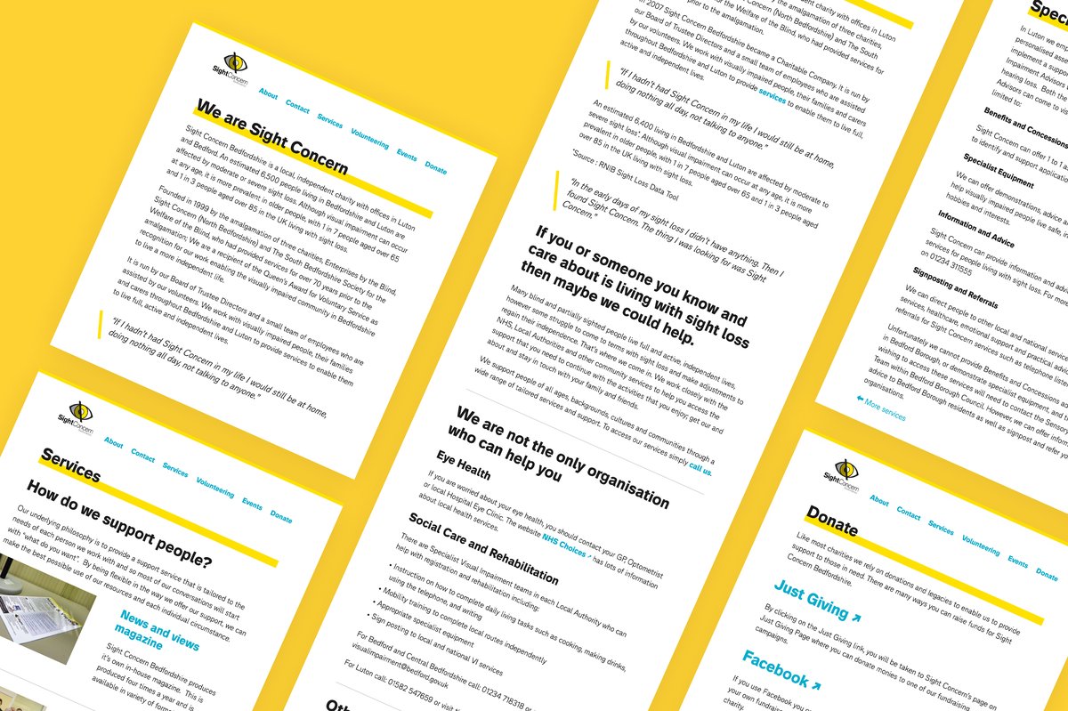
The team prioritised simplicity and functionality over flashy design elements. Instead of relying on complex layouts, carousels, or excessive imagery, they focused on creating a clear, linear structure that works seamlessly for all users, regardless of how they access the web.
3. User-focused design
One of the most innovative aspects of the new site is its navigation structure. While visually, the navigation appears at the top of the page, for screen reader users, it comes after the main content. This approach mimics how people naturally consume information: read the content, then decide where to go next.
4. Accessibility doesn't have to break the bank
A common barrier to improving web accessibility is the perceived cost. However, this project demonstrates that significant improvements can be made without excessive spending.
5. Benefits beyond accessibility
The team's approach to accessibility has yielded benefits beyond just serving users with disabilities. The streamlined, efficient code means the site loads quickly even on slow connections, making it more accessible to users in areas with poor internet infrastructure or those using older devices.
6. The importance of testing with humans
While automated tools like Silktide are valuable for identifying technical accessibility issues, the team stresses the importance of testing with real users who have lived experience of visual impairments.
Setting a new standard for web accessibility
Sight Concern Bedfordshire's new website sets a powerful example. It shows that with the right approach, organisations of all sizes can create highly online spaces that are not only highly accessible and user friendly for all, but also efficient and cost-effective. This project proves that significant strides in accessibility can be made without compromising on design or functionality, and without requiring enormous budgets.
As we continue to evolve our online communication, let's remember: web accessibility isn't just about compliance—it's about creating a truly inclusive world.

Check out Sight Concern Bedfordshire and the new accessible website


