How design can clarify your needs for a better partnership relationship
It's hard to ask for digital things
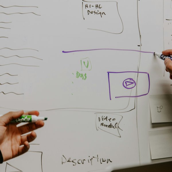
When receiving briefs, it’s not uncommon for the details to be hazy or open to interpretation. There is a risk that what our partners envision and what our team delivers aren’t always perfectly aligned—especially when requirements are complex, or when there’s a need for iteration as the project evolves. Everyone is so busy, and knowledge transfer and experience differences between organisations are tricky. This is where design becomes a critical tool—not just for aesthetics, but as a way to visually ‘play back’ a brief to help get everyone aligned. Designs help translate abstract requirements into something tangible, allowing all parties to clarify expectations before moving into development.
Visualising the Brief: The Role of Design in Feedback
Design acts as a mirror to the brief—it can show the ideal version of what’s been requested, but it can also expose areas where there’s a lack of clarity or where more iteration might be required. This process helps the project team adapt their approach, whether it’s revisiting the scope or adjusting timelines to keep budgets tight and focused.
It’s much easier (and cheaper) to resolve scope clarity issues before development starts. If you wait until later, you might end up hearing the dreaded phrase: “That’s not what I imagined.” So how do you know what level of design to provide? It depends on the clarity required by the team. Sometimes a sketch/wireframe will suffice to map out the bones of the solution; other times, a fully rendered design may be necessary to help convey the nuance of the visual and interactive experience. If it wasn't clear when you see it, that's a great piece of feedback and learning for the project team. Dialling in the level of communication is something that evolves through a partnership, and it often takes a long while before teams to instinctively know the other side means from verbal communication alone.
The Three Essentials: Layout, Interactions, and 'The Invisibles'
To ensure designs communicate the right level of detail, there are three crucial areas that should be covered:
- Layouts and Sequence: This refers to the structure of the journey. Understanding how users move through a service or application is key. This could be as simple as mapping out a user flow or building a wireframe that shows the steps in sequence. This visual map helps anchor conversations around what’s essential and where potential scope creep might occur.
- Blocks and Widgets (Interactivity): Think of this as the interactive components—the places where the user interacts with the system. Wagtail users will already be familiar with the idea of ‘blocks’—these modular elements like text, forms, or custom interactive widgets. These are crucial for clarifying the functional pieces of a project, making it easy to identify where actions happen and how users engage with the system.
- ‘The Invisibles’ (Side Effects): Not everything in design is visible on the surface. ‘Invisibles’ are the processes that happen in the background: things like data flows, email notifications, or interactions with analytics. If a partner isn’t thinking about these elements, it can lead to surprises later. Making sure these side-effects are documented and communicated is essential for a smooth project handover.
When these three components are clearly defined, feedback becomes more precise. Everyone is working from the same playbook, and there’s a shared understanding of what’s being built.
Responding to Designs: Less is more?
It’s easy to get caught in the trap of thinking more things being produced in a design equals a better product. But sometimes, less is more—especially when working within tight budgets and timelines. Briefing "do less" as a response can often produce better results, as it allows for a leaner, more focused approach. While the natural fear is to make sure there is 'enough', there’s always room to add more later, once the core functionality is working and the scope is clearer.
The role of design in a project is not just about delivering something beautiful and accessible—it’s about creating a shared understanding. By using design to clarify layouts, interactions, and ‘the invisibles,’ teams can align expectations, avoid costly missteps, and build stronger, more effective partnerships.
This approach ensures that both partner and production teams can move forward with clarity and confidence, knowing that what's being built matches the shared vision.


